 Nicolò Gallucci, third-year architecture student at the renowned university Bauhaus-Universität Weimar, wrote a successful essay of the new office building of Marmi Rossi, entitled ‘architecture and aesthetics
ARCHITECTURE AND AESTHETICS
Architecture should adapt to the needs of the inhabitants, since men themselves invented architecture to improve the quality of their life.
Heidegger once said: "Wir wohnen nicht, weil wir gebaut haben, sondern wir bauen und haben gebaut, insofern wir wohnen, d.h. als die Wohnenden sind". (We do not dwell because we have built, but we build and have built, because we dwell, that is, we are dwellers)
Architecture emerged when human beings started to seek shelter and wanted to define spaces and to separate the interior from the exterior.
The development of society changed the intent of architecture, which was no longer used for only functional purpose, but rather as a static and concrete form to show the customer’s social status. Already in antiquity, people acknowledged that they could demonstrate the value and strength of a city or an empire through architecture. You clearly notice that when looking at the Egyptian pyramids: you don’t see a simple tomb of a Pharaoh, but a symbol of his power as well as the connection between him, his people and the gods: these symbolisms and forms represent the magnificence of an individual person regardless of the building’s function. (ed.)
In the history of construction, functionality is often in opposition to aesthetics. The problem is the momentariness of all things. The building’s monumentality may survive history and aesthetic standards for many decades and even centuries, while the building has since long lost its functionality. Aesthetic beauty remains even if the functionality loses its meaning over time, as the function of a building depends temporarily on the society’s needs and customs which are constantly changing.
"There are constructions of the past, various churches and buildings that are used in a different way nowadays; they’ve survived changing their function though: we are still using or visiting them. This happens when a building corresponds to beauty but not to the usefulness of a certain period; anyway, beauty and poetry outlast time." (cit. Oscar Niemeyer)
Architecture is perceived in two phases: first, the viewer notices the form of a building and then, he comes up with an idea. Only then, he starts thinking about its function while searching for hints to understand the different spaces and their use. Generally, the architecture’s function depends on the form of the building, but sometimes, the function is given by the building’s form.
When industrially used buildings are developed, functionality has to be combined with aesthetics, mainly to guarantee appropriate working spaces and ideal working conditions. On the other hand, the aspect of a building needs to show the importance and the value of the company
This issue is evident in the stonemasonry industry where the competition is really tough. In the last years, many companies have decided to enlarge their business and started therefore a sort of architectural competition.
On occasion of the 50th anniversary of the company, the project that architect Silvia Bettini designed for Marmi Rossi, should symbolically represent the renewal of the company and the future generation change.
It is commercially very important to show the quality and the technical innovations of a company. Architecture is a concrete and direct demonstration of this: modern humans are always attracted by novelty while trying to link the surrounding spaces and forms. The architect’s mission was to express the quality of the company while choosing an impressive and highly aesthetical architecture. Rationalistically, the functionality came only on second place. Contrary to a functional architect, Bettini developed the project from the outside, the interior was planned subsequently. Although the architect was mainly concentrating on the mere beauty of the building’s exterior, the interior spaces had been determined as well, since they had to be adapted to the building’s form.
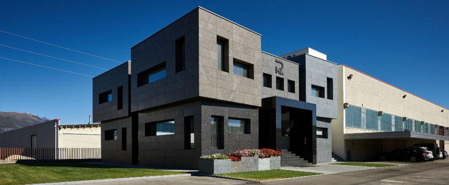
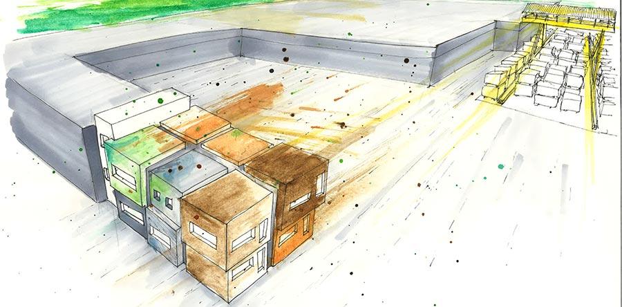
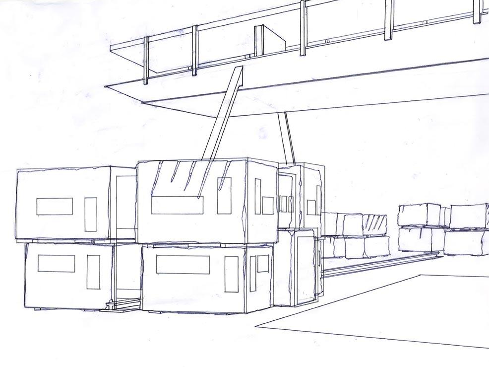
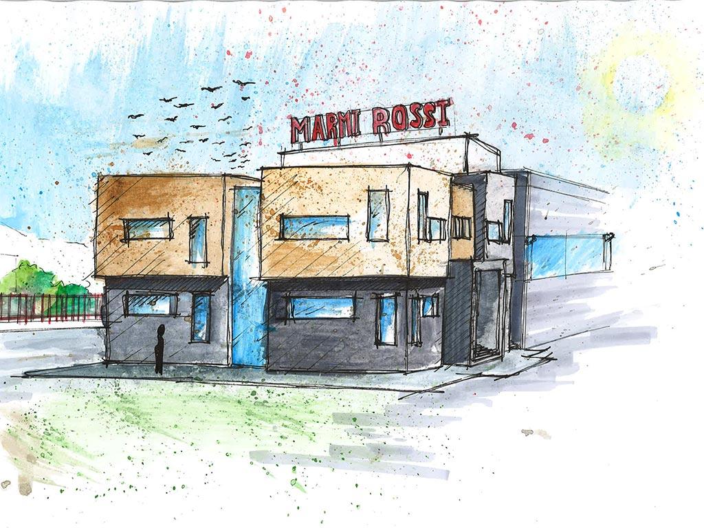
The initial drafts were meant to guarantee a modern and bright work space, but it should also show the function and characteristics of the company, while serving as a showroom for the sales material. The building’s design was inspired by the monumentality of granite blocks. The stone block with its big dimension and notable height is a natural phenomenon and instils respect and reverence. The architect transformed this feeling into architectural forms in order to evoke the same emotions. "The building –explains the architect- should remind us of intact and uncut granite blocks that are piled one on top of each other, while every single block has its own dimension and imprecision". The monumental and static architecture was thus based on imitating a natural phenomenon.
The building’s aesthetics will always meet the needs of modern dwellers as well as the guidelines issued by the contemporary society. John Summerson says: "Already in the antiquity, the architects had to choose a specific stylistic ornament, such as Doric, Ionian or Corinthian, developing it according to precise standards and guidelines, without taking it out of its context..."
If the architect is orientated towards pure aesthetics, he will completely concentrate on symbolism and expressionism.
The architect Silvia Bettini, designing usually aesthetic projects, always tries to create a cosy atmosphere for people, which is rather based on beauty than on functionality. The beauty and elegance of the chosen forms and materials excuse any possible flaw or lack of a rationalistic concept. The architect aimed to free herself from restrictive standards of functionality and to come as close as possible to an architectural concept devoid of rigid directives.
The lack of functionality doesn’t mean that architecture in itself failed, more precisely, it is a different way of interacting with society. The avoidance of contemporary functional standards is explained by Bruno Zevi in his book “Il linguaggio moderno dell'architettura” (Einaudi, Torino 1973), where he critically relates to John Summerson. Zevi points out that architecture isn’t an object that exists as a single element in its context, but rather an art work free from restrictions, since it grows out of free expression and human feeling.
Functionality and aesthetics represent a sort of communication between architecture and society. Regardless of the architect’s concept, it’s up to society to judge the building’s quality and to acknowledge its possible defects.
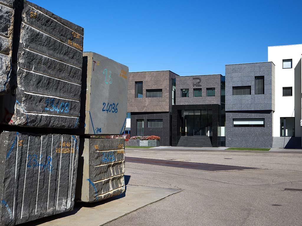
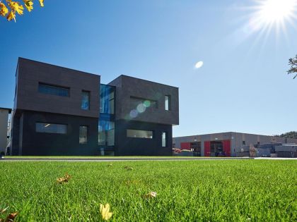
The new office building of Marmi Rossi has two levels and a basement, its design reminds us of the near block deposit. Each of the two floors is made of six granite blocks, corresponding to a total of twelve blocks with different dimensions and positions, only separated by narrow and long window fronts that pass vertically along the building façade and horizontally towards the roof. These glass façades reflect the space between the blocks on the block deposit, from where they are either moved to the cutting saw or transported to the customer.
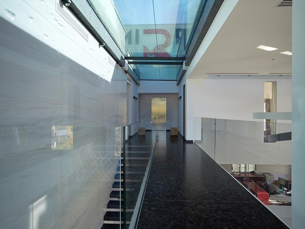
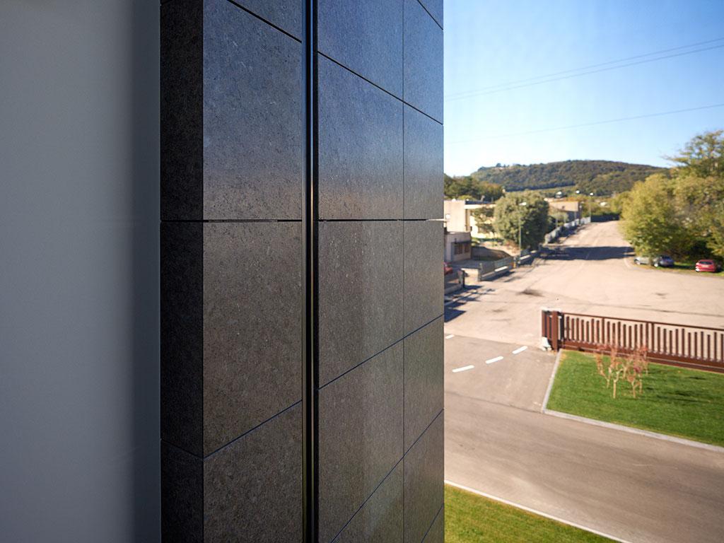 The architect comments about the glass façades: "In the building, the customer moves around as if he would walk between the blocks, getting the same impressions as in nature and perceiving the same strong contrast between shadows and lights". To strengthen her concept, Silvia Bettini decided to extend the exterior granite cladding into the inside, only separating it by a frameless glass front. It is hard for the visitor to recognize whether he is inside or outside the building. Bettini says: "My aim was to give lightness to the building even if it is made of heavy granite blocks ".
The building is located on three levels, each of them measures 250 square metres with different heights: 2,40 metres (basement), 2,70 metres (ground floor) and 2,85 metres (first floor).
The perimeter is made of concrete, cladded with hard insulation. The walls and the roof curbs are cladded with twelve different granite slabs of various dimensions and colours that are anchor-fixed on the grid of the concrete load-bearing wall. On the roof, between the vertical and horizontal running granite slabs are located rainwater run-offs, that are hidden behind the granite slabs.
The joints of the wall cladding coincide with the outlines of the openings that are cutting the façades, so it seems that the windows are part of the building’s cladding. The choice of the different types of granite was really hard work, since the exposed material should function as the company’s showroom. At least, dark granites with satined surfaces were used for the cladding, their colours range from anthracite and brown to green. The following materials have been used: Black Pearl, Cafè imperial, Brown antique, Azul California, Virginia Black, Labrador Antique, Olive Green, Labrador Blue Pearl Tfv, Verde Marina, Imperial Brown, Azul noche, Volga Blue
The frames of the separating glass front are hidden in the walls; the angle where the vertical glass front meets the horizontal one has only a small joint with seals on which both glass plates are applied. The glass fronts positioned on the roof have a slight slope for a better flow of the rain water.
The main building entrance and the service entrance for the drivers are located on the south part of the building and are illuminated by night via small Spot lights. Above the entrance cube, the logo of Marmi Rossi is engraved on the granite cladding.
The secondary entrance is located on the back, that is to say on the north side, and has a ground-floor access.
The west side is facing the street while the east side leans against the already existing warehouse building. The warehouse has a white wall that overlooks the new building’s roof. The architect Bettini designed the company’s logo with big letters on this wall and illuminated the sign from behind, so that it is easily visible in the night. This wall is intended to symbolise the big overhead-travelling crane that moves the blocks on the near block deposit.
